Clearviction is an open source nonprofit working on a product called the Eligibility Calculator, which users can use to determine if they are able to vacate their criminal conviction in the state of Washington.
Due to the punitive prison industrial complex in America, many people who have a record can face barriers to housing, employment, education, and government assistance, even if they have committed a nonviolent offense. However, it is possible for some people to vacate their conviction, which can help them access these programs and improve their quality of life.
Unfortunately, the process to determine one’s eligibility can be complicated if one does not know how to navigate the legal jargon.
The goal of this product is to simplify this process by doing the following:
Because of the sensitive nature of the problem our product wants to address, we want to make sure we are using appropriate language for our intended audience.
Our goals for creating the content we publish:
UX Designer,
UX Writer
Cross functional partnership between Clearviction’s Marketing, Product, and UX Research teams
3 months
The UX Research Team provided user personas for us regarding our intended audience.
However, I also did my own research regarding our user base specifically for the language guideline and discovered the following:
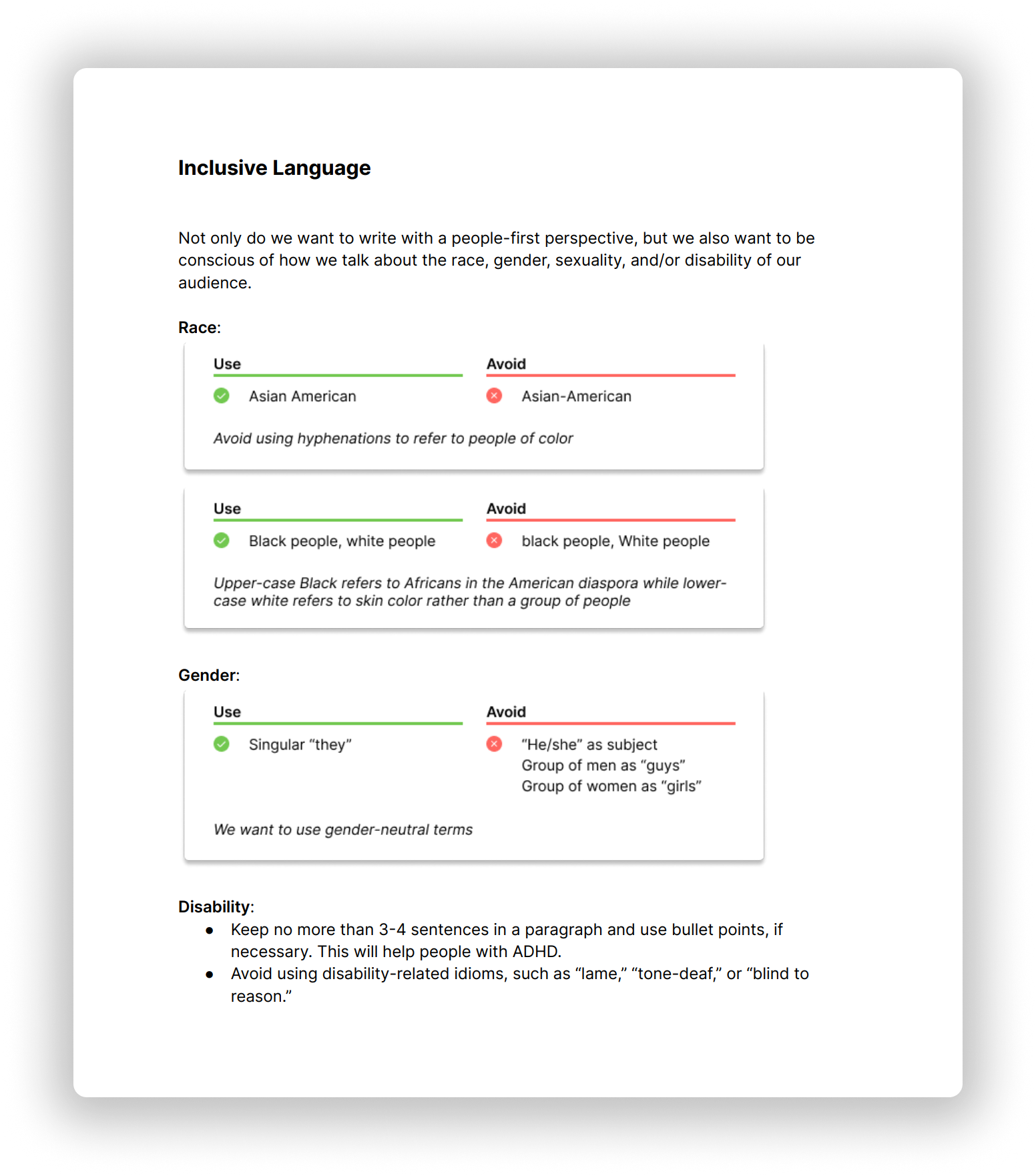
To make our product accessible, we want to make sure that our content is readable for everyone.
As the lead designer for this project, I completed the research of several different language styleguides, with Atlassian and Survey Monkey being the most popular picks that I felt were most relevant to what we wanted to do. I received help from other designers and content writers in getting my hands on the AP Styleguide and the Washington State Post, which were much more difficult to access.
Based on the research, I decided that we needed to work on the following subcategories:
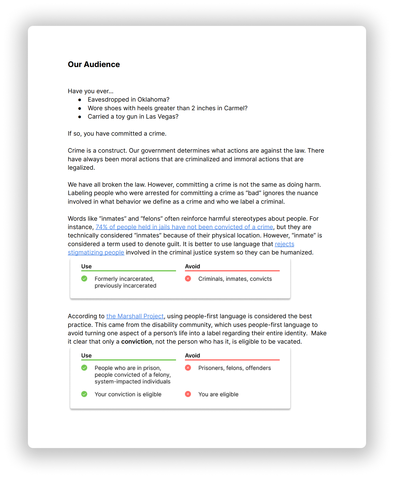
Because the language styleguide affects everyone in the organization, I wanted to make sure that it accommodates everyone. During the process of developing it, I went through the existing research done by previous content writers on the stigmatizing language the organization should avoid. Based on that, I expanded the language styleguide according to the needs of our product.
Throughout the iterative process, I made sure to keep the UX Research Team, Product Team, and Nemo in the loop. The styleguide was looked over by other educators, designers, and content writers to ensure that it was relevant to their respective fields and consistent with the values of the organization. I credit my partner, who was a project manager with the Marketing Team, for taking the lead in the Social Media portion of the styleguide.
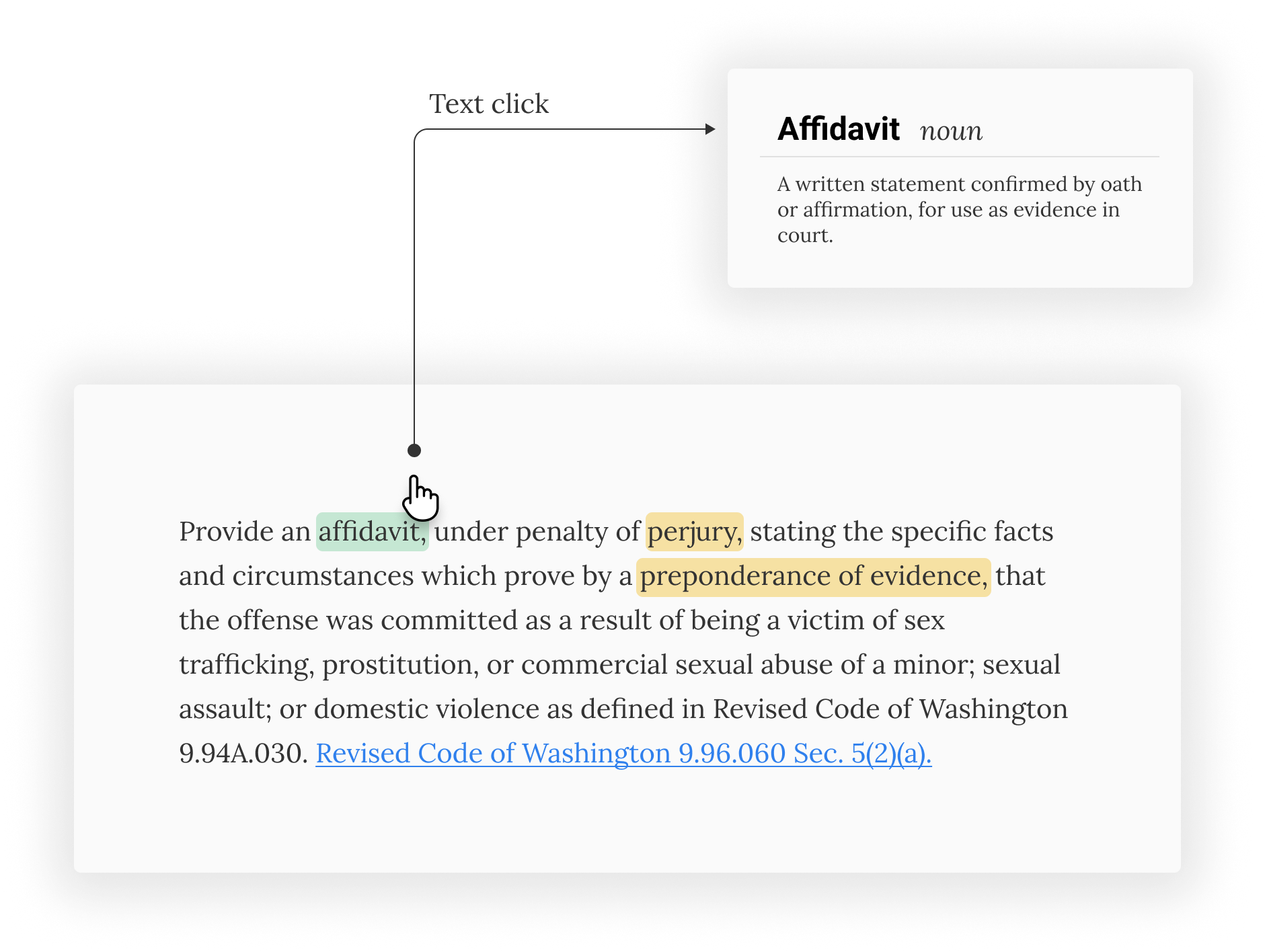
Because we cannot provide legal advice, we are not allowed to paraphrase or simplify the legal content in case we misrepresent it to our users. After brainstorming with my partner, we decided that we could provide a glossary or define terms that hovers to the side when the users click on the text. This way, people who are struggling with some of the legal terminology can quickly understand what they are reading.
I presented the finalized document to the organization, which at the time had 18 pages total. Not only does it standardize the user-facing language in our product, website, and social media, it also standardizes the language for the onboarding process for new volunteers.
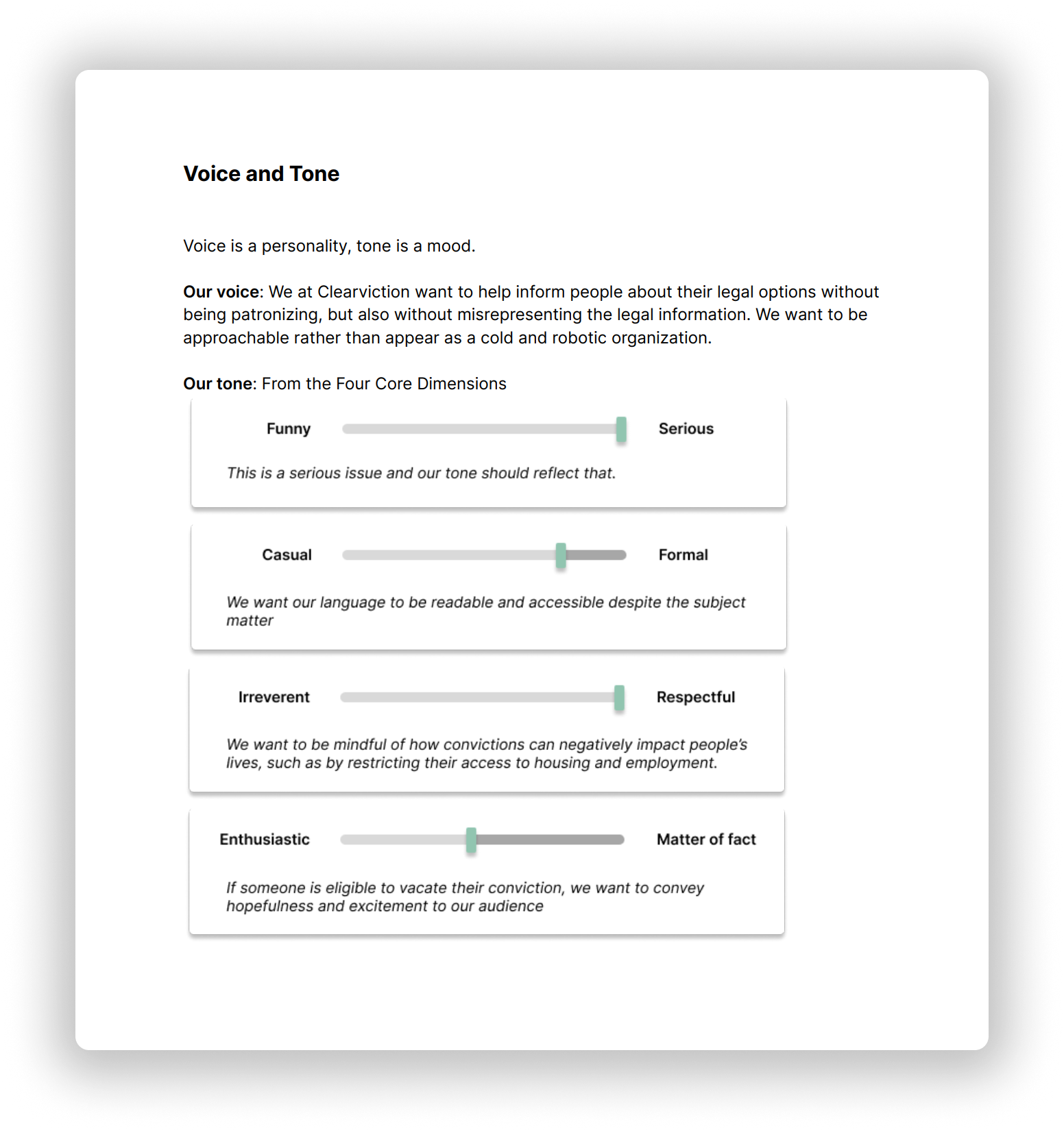
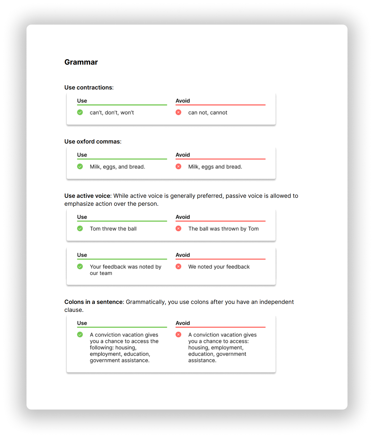
Here are some of the excerpts taken from the language styleguide:
The language styleguide was well received by everyone, but especially by the following teams:
100% of responses have been positive, even for people who did not regularly use language guideline, because it helped them think more critically about how we use language and why it was important to be mindful about it.
Language is always evolving. What words are considered appropriate today will likely shift in the future. This guide should be regularly re-evaluated to reflect that change.
As the language guide gets regularly used by different teams as well as our user base, it should change according to their needs rather than being a prescriptive rule everyone must follow.
An organization’s website is the first thing a potential user sees when they are looking for solutions to their problem. If the website doesn’t inspire trust, the user will not proceed with the offered product.
Although Clearviction does not collect personal information, because the Eligibility Calculator asks sensitive questions about the user's background, it is crucial that the website appears professional, reliable, and easy to navigate. To ensure that the website stays relevant, I helped out with the following tasks:
UX Designer
Cross functional partnership between Clearviction's Marketing, Product, and Website Redesign teams
3 months
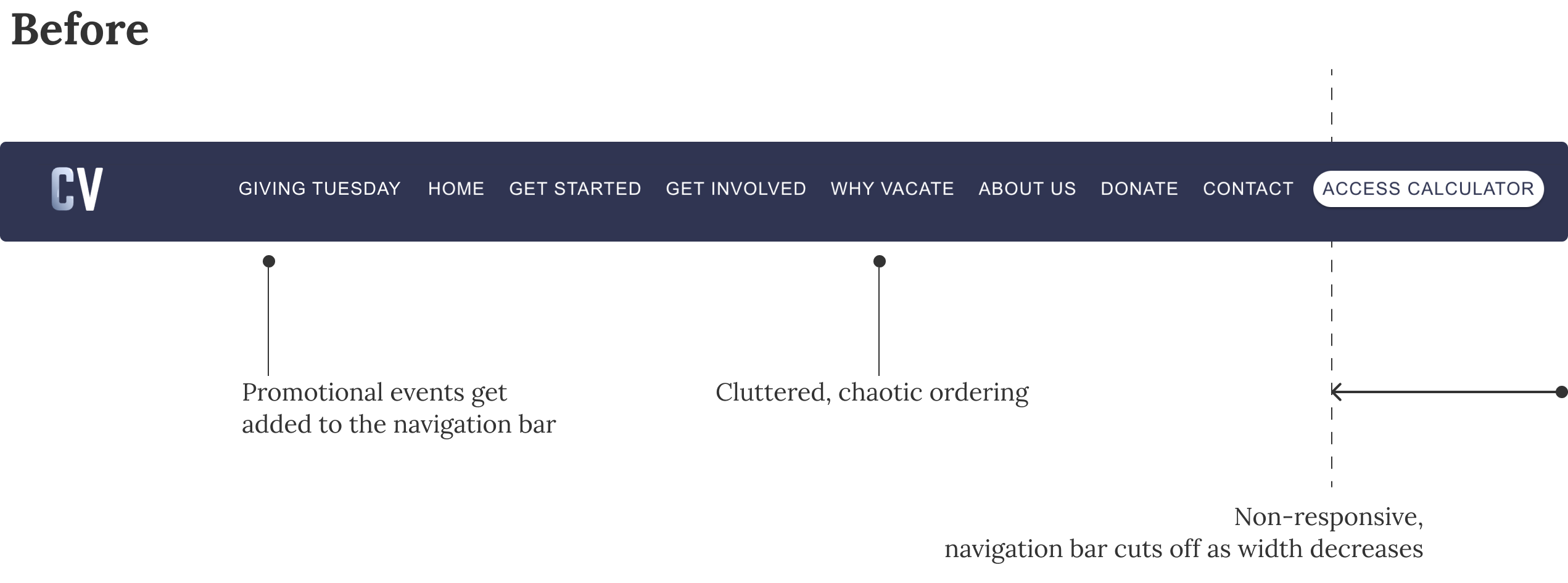
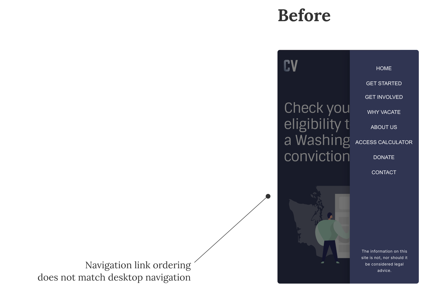
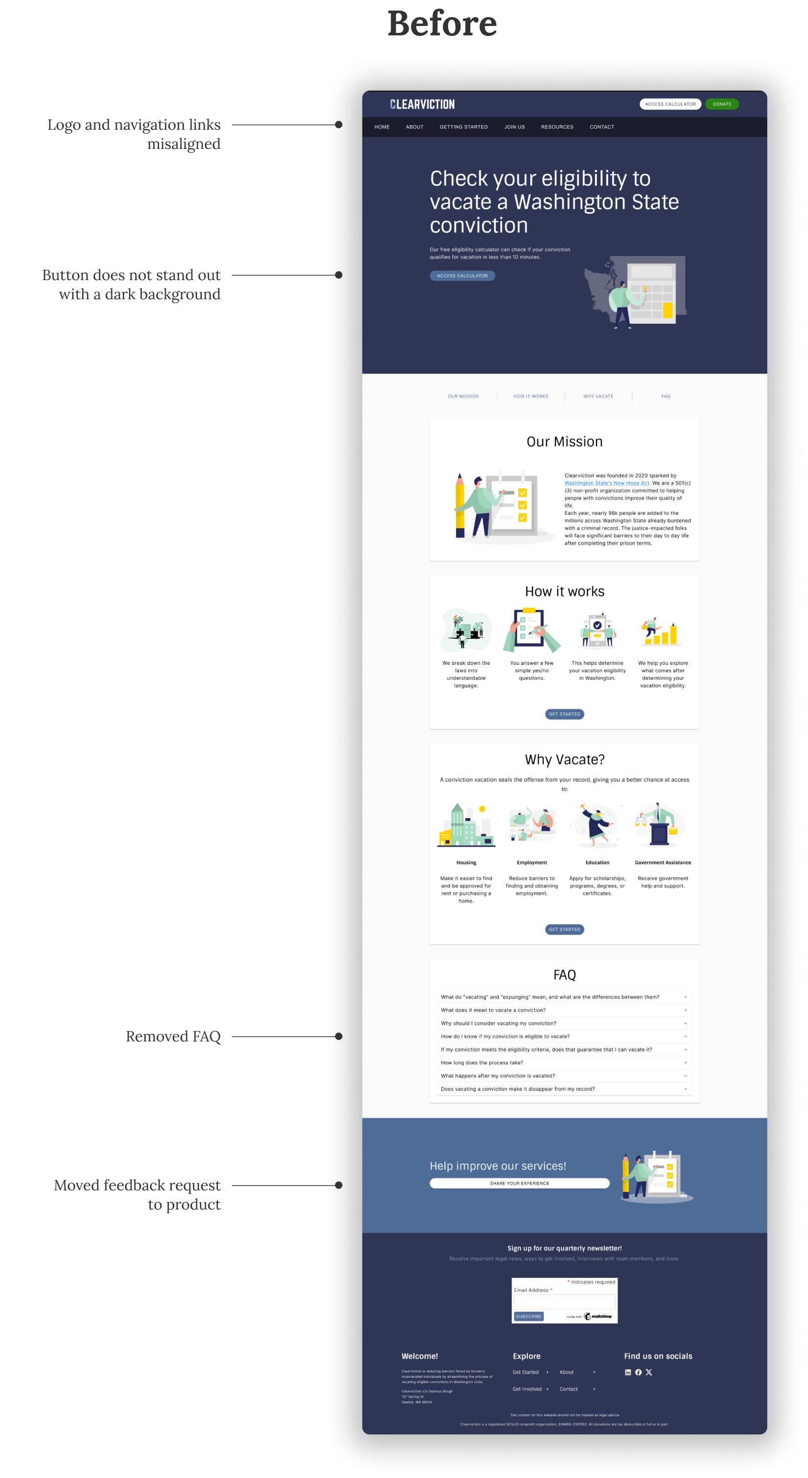
Before, the navigation bar was too crowded. Because it was not responsive, the rightmost links would get cut off as the window decreased in width. I also noticed that the links on the bottom page did not match the links on the navigation bar, and one link redirected to an outdated page no longer in use. We had to notify the developers about this inconsistency.
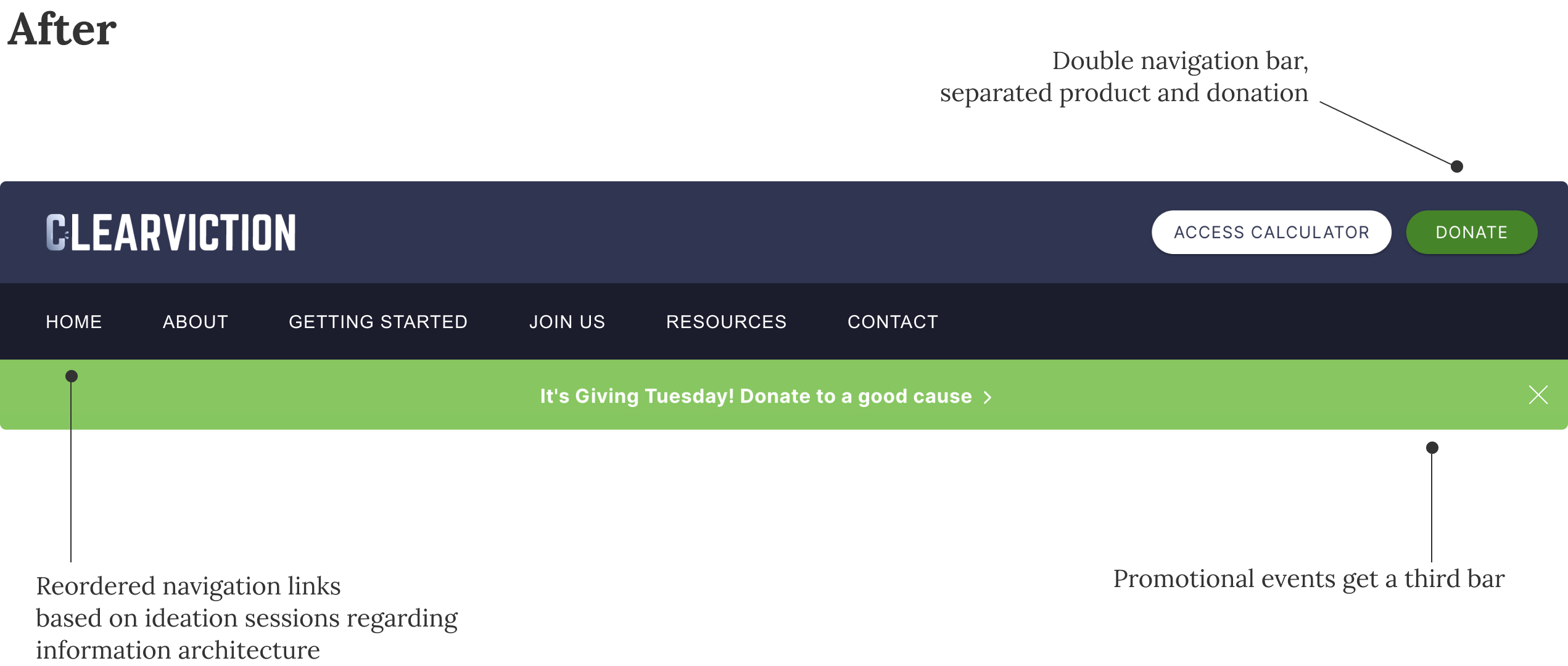
To address the problem surrounding the information architecture, I researched several different navigation bars and decided that we should use a double navigation bar - the first row should feature our most important components regarding access to our product, while the second row had to do with the website navigation. I also reordered the links after going through ideation sessions with the Marketing Team before sending the final version to the developers.
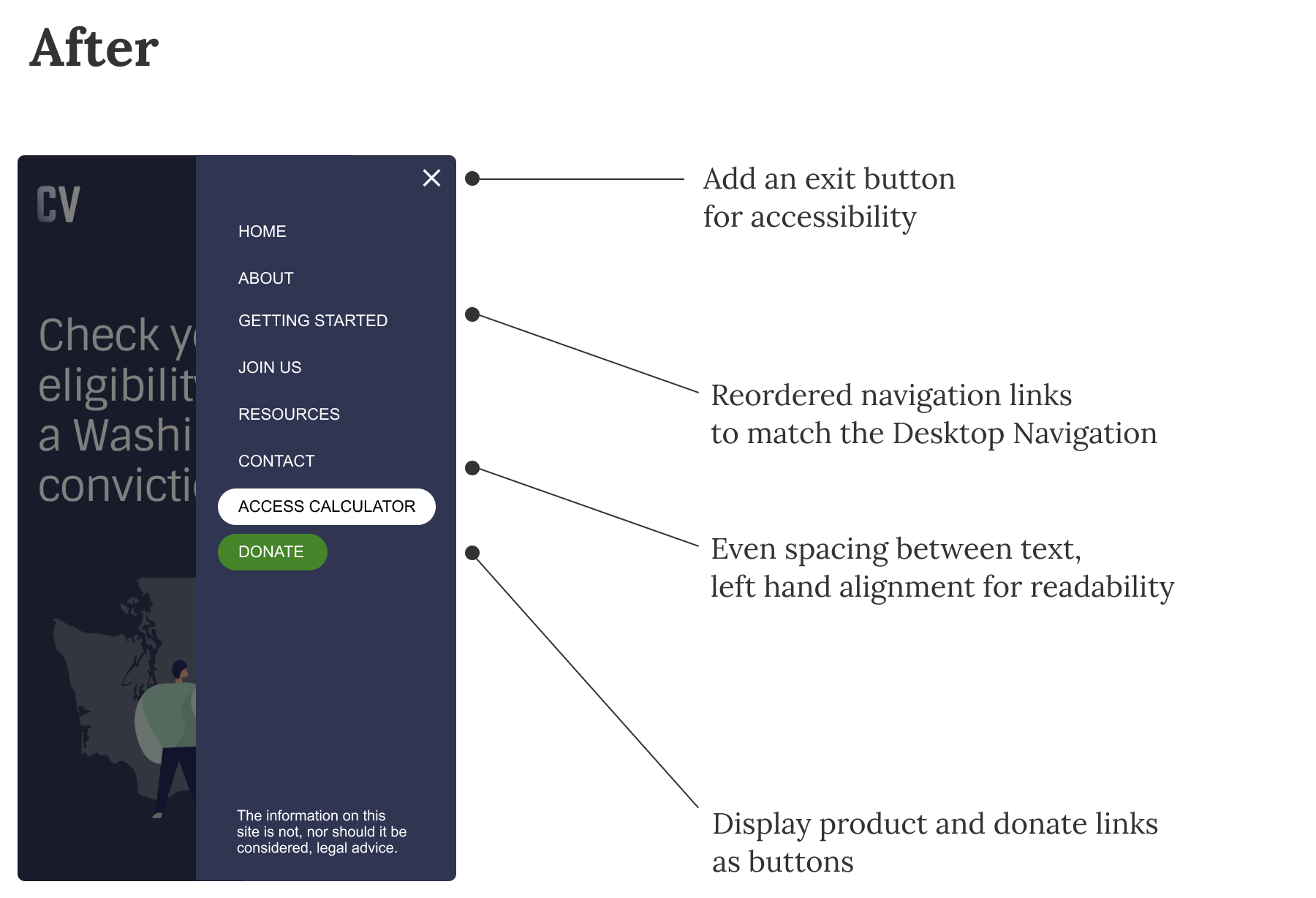
For the mobile navigation, I noticed that the links were in a different order than in the desktop navigation. There was also no exit button, which is an accessibility issue. During the redesign process, I corrected both issues and opted to include the top row navigation links as buttons to signify their importance to our product.
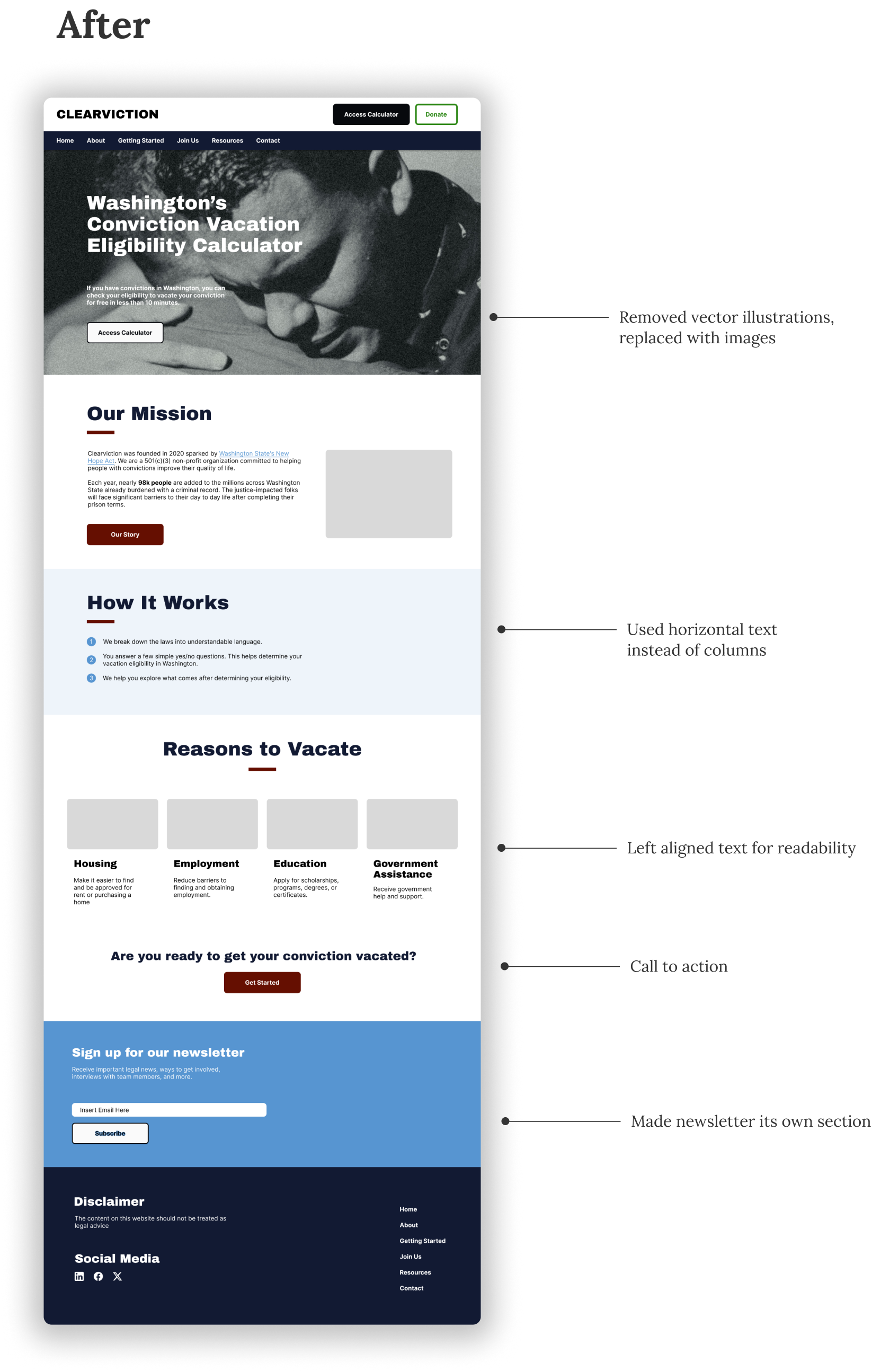
Because the website was dated, we created a Website Redesign Team to give it a streamlined, modern look that would attract users and future partners. Through ideation sessions via group jamboards and digital collaboration, we came to the following conclusions:
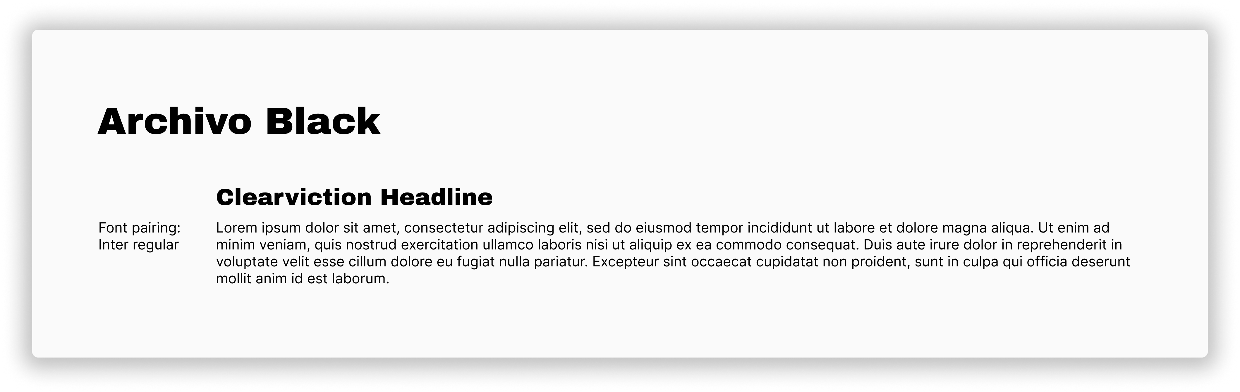
The problem was that the current website used two fonts that looked identical – Inter for body and Sintony for headings, both san serif. In my discussion with the designer responsible for the former styleguide, I discovered that we wanted to avoid using serif font because it appears official and tied to a government entity, which could give the wrong impression to the users.
I paired several different san serif fonts together, and when presenting it to the Website Redesign Team, the favored pairing included Inter for body and Archivo Black for headings.
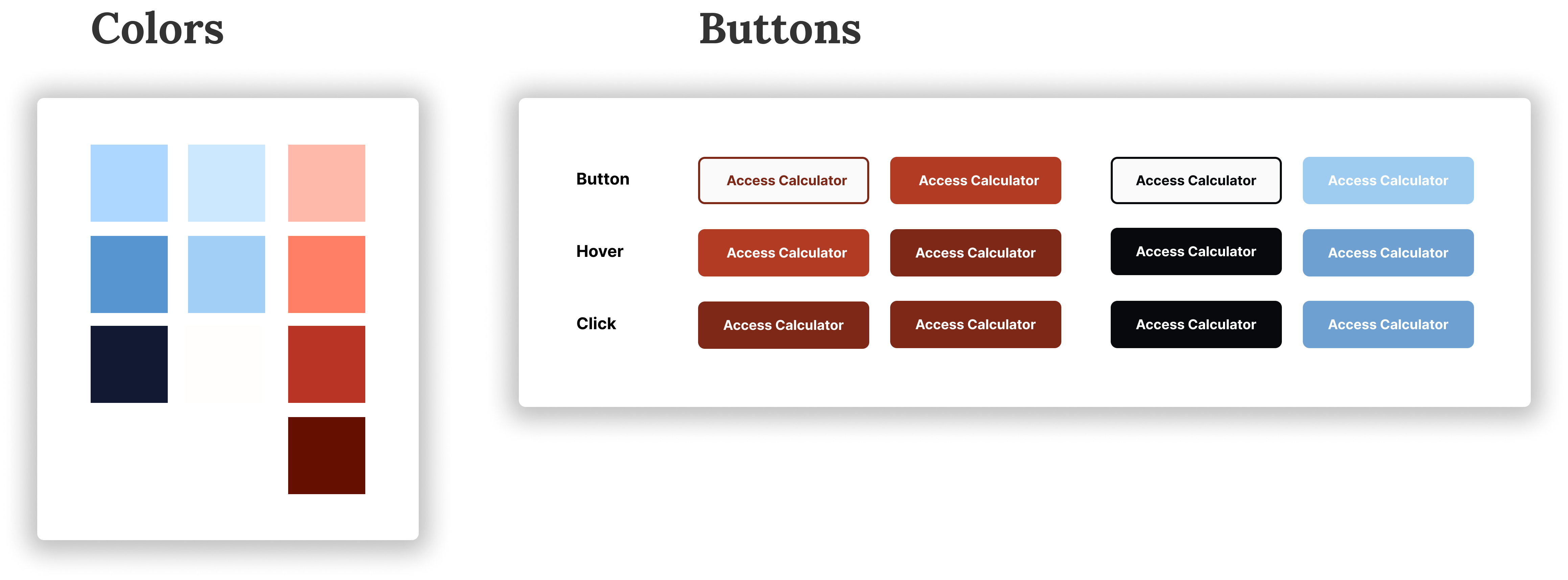
Because there is not much variety in terms of colors, the buttons tend to blend into the website, making it difficult for users to identify them. My fellow designer with the styleguide put together a series of color palettes that kept to the organization’s theme while presenting more options for us to use. Based on the updated color scheme, I created a series of buttons that had a more modern look compared to the original circle buttons.
Based on the ideation sessions and the changes made in the styleguide, I created a concept design for the updated website.
Although this organization was an open-source nonprofit, it functioned like a remote startup and had an intense environment. This is where I first learned about participating in design sprints and completing tasks as tickets on Airtable. I wore many hats and picked up new skills as the situation called for while collaborating with other designers, researchers, and content writers. It was a positive experience overall, as it taught me to be proactive and take charge of different projects whenever I notice a problem with our product.


